Toronto Ultimate Club
BACKGROUND
The Toronto Ultimate Club (TUC) is a not-for-profit sports organization focused on providing the highest quality Ultimate Frisbee experience to the Greater Toronto community. They run leagues and clinics year-round, support local touring club teams, and have over 3500 members varying in age, gender, and skill. The club is primarily run by three full-time managers, a member-represented Board of Directors, and a wealth of member volunteers.
THE NEED
After 17 years sporting the original logo created by two early members, the club sought to rebrand to reflect the evolution and growth of the organization since its incorporation in 1995. A request for proposal was put out seeking concepts that were modern with a professional edge, and reflective of the club’s mission, vision, and values.
RESEARCH + CONCEPTS
The starting point of the project was to examine what was already out there in the form of Ultimate club logos, to get a sense of the competitive landscape. Some initial brainstorming included analyzing significant elements of the game from my own personal experience, unique characteristics of the club itself, and the city of Toronto.
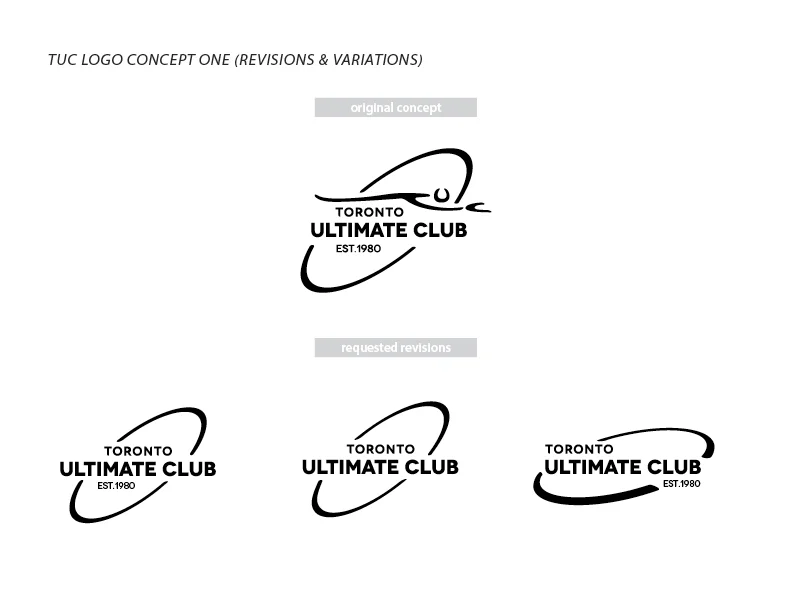
Sprouting out of the research and brainstorms came two distinct concepts. The first paid homage to the old logo, reconfiguring the figure known as “Snakeboy” so that it comprised of the club initials (TUC). The second concept focused on another common silhouette in the game of a figure jumping up for the disc, set in front of the Toronto skyline. A simple sans-serif font was selected in both instances for its modern look and feel, and clean edges.
Both concepts were digitized and refined then submitted with full design rationales and initial colour suggestions.
SHORT LIST + REVISIONS
The first concept was short listed by the Board of Directors, but with some requested revisions. However, because the nature of the requests seemed to deviate from the initial brief, I was curious to understand the underlying thinking behind the desired changes and posed some probing questions back to the Managing Director and the Board.
The response was that they wanted to see something simpler and were steering towards a logo that was more telegraphic to both players and non-players alike, a criterion that was not included in the initial brief.
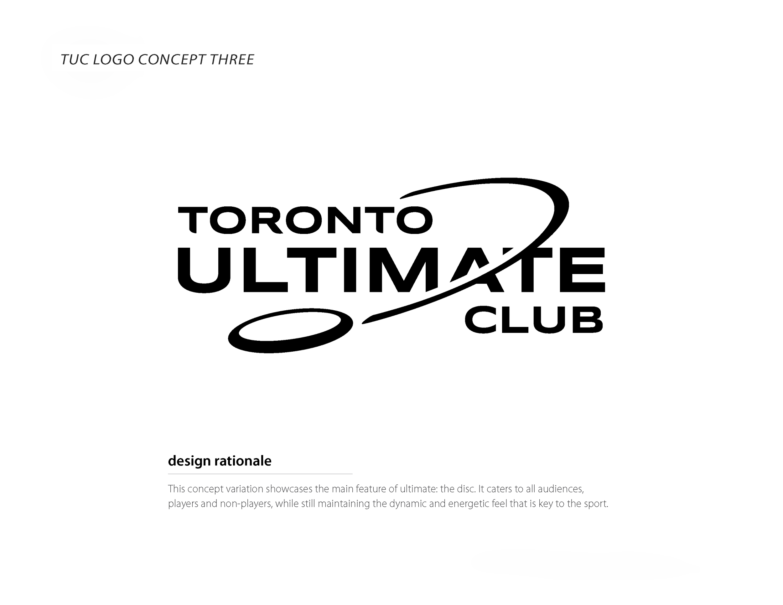
I revised the original concept addressing the requests, but also developed a third concept based on the new information provided. The new design focused on the shape of the disc rather than iconic poses that would only be familiar to existing ultimate players. Dynamic movement and energy are introduced to the logo by having the flight path of the disc cut through the name of the club. Smaller design details such as slicing and rounding off the edges of select letters were also included to promote movement of the eye from one character to another.
SELECTION + VARIATION
After approximately one week of deliberation, the Board unanimously selected the newly submitted concept. The next step was to hammer out the colours for the logo. A variety of 2-colour options were provided using the club’s values as a springboard for ideas on initial colour selections.
After seeing the 2-colour options, the Managing Director and the Board sought for a single colour logo instead, wanting to see options in a vibrant blue to express the energy and dynamism of the sport. Several Pantone options were given as well as some 2-colour options pairing the blue with a grey to give some visual depth. Ultimately, a bright blue was chosen for the final club logo.
BRAND SYSTEM DEVELOPMENT
As with any new identity, a supporting system had to be developed with guidelines to protect the new brand. The process was slightly backwards as the club had the immediate need for new templates first, before the style guide was fully established. This need was driven by the milestone move of their headquarters to the new clubhouse at the renovated Monarch Park Stadium
A PowerPoint template was the first thing on the chopping block. The TUC Blue with a white oval knockout for the content served as the base for the template master. The curve of the disc’s flight path was then used to create a stylized arc, looking like a gritty brush stroke. Letterheads, envelopes, and business cards followed suit, carrying on the brush stroke motif. The club’s vision and mantra were also incorporated into the designs.
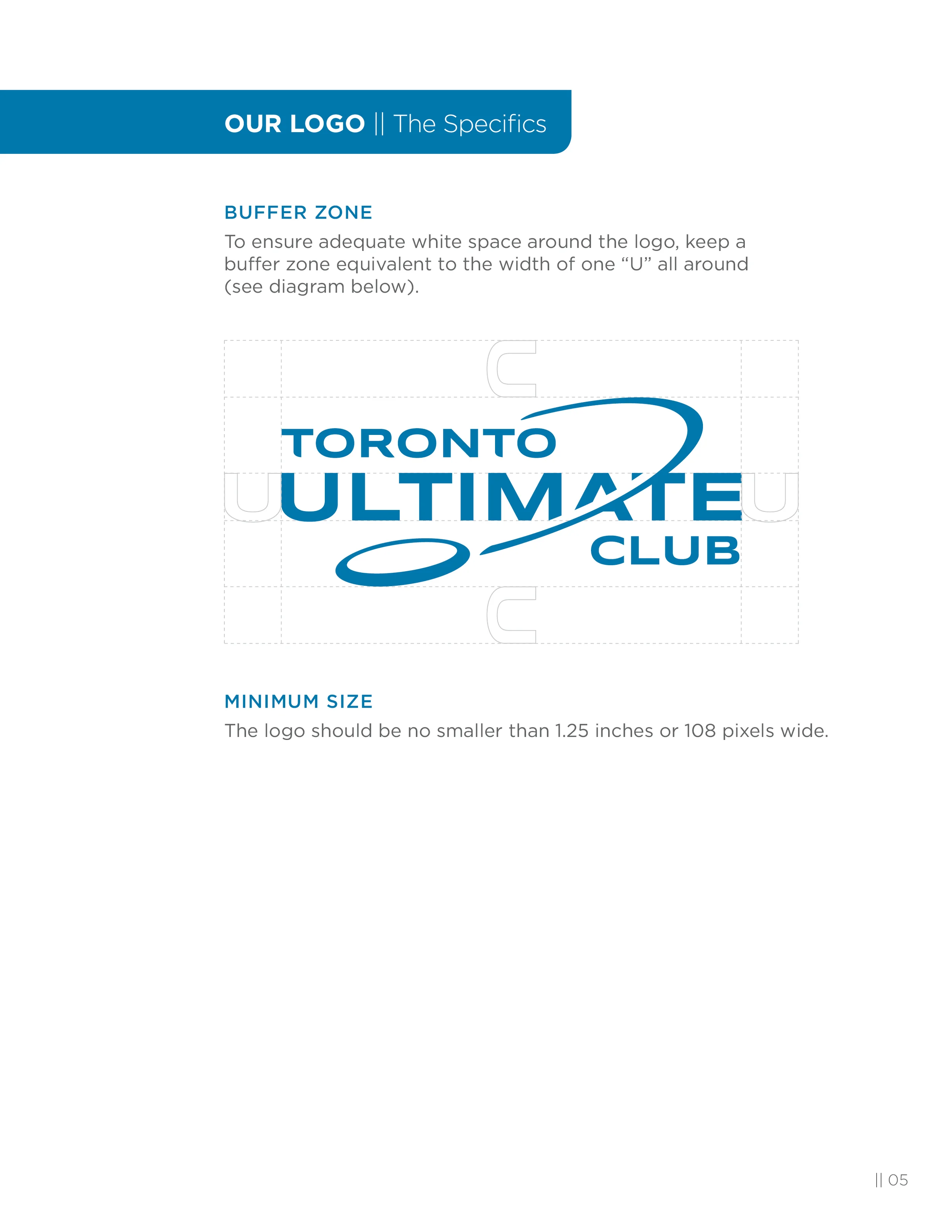
After the initial needs were addressed, creating a style guide was imperative to ensure proper use of the brand elements. All content was written by yours truly, utilizing the metaphor of the brand system as a team, with different elements playing a key role in the success of the brand.
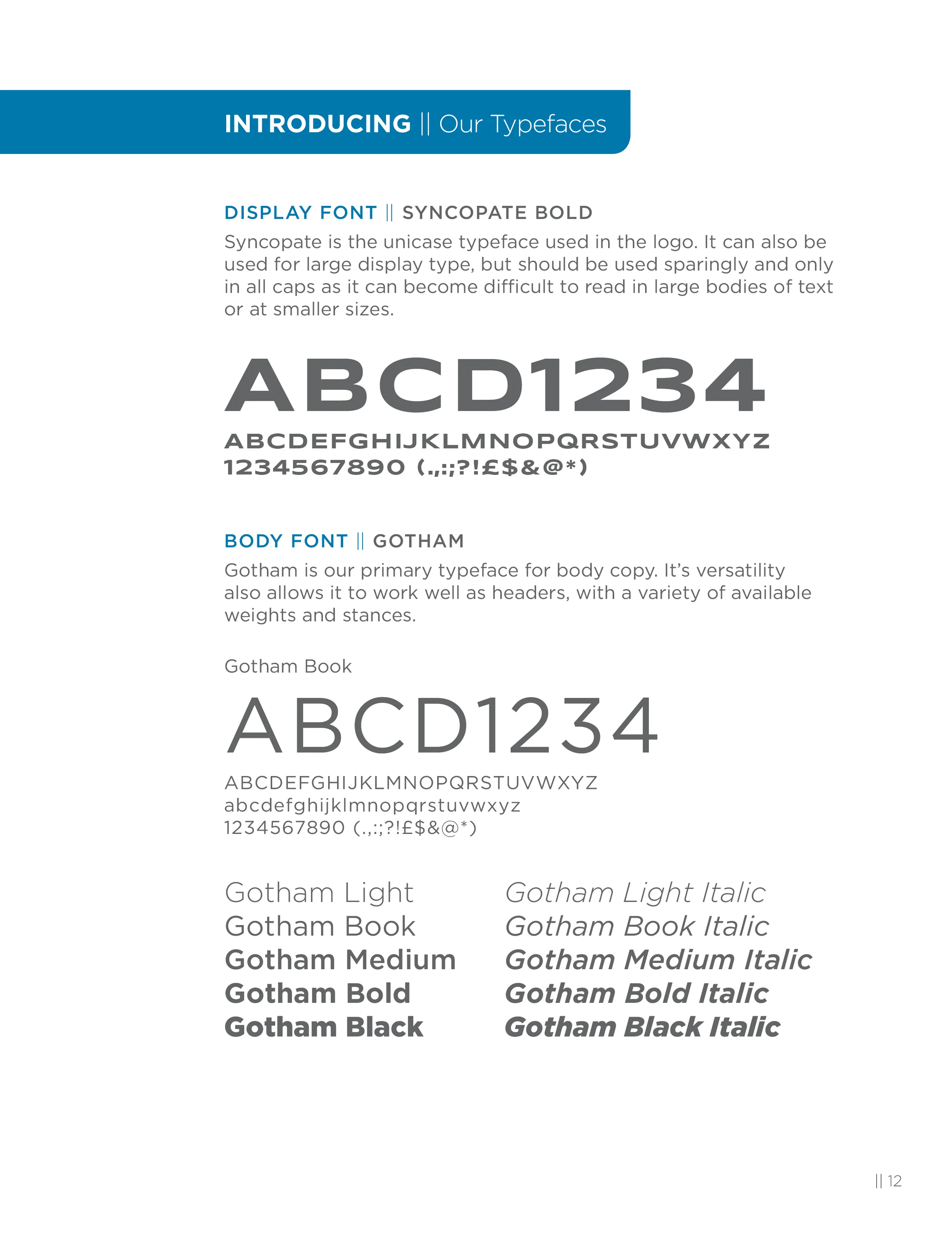
The guide was extensive, beginning with a short introduction on the club followed by the do’s and don’ts around the usage of the logo, as well as the available palettes and guidelines on where and how to use them, and the typefaces selected for the brand.
MARKETING INITIATIVES
The first marketing opportunity for the new brand was the member discs that were given to all new and returning members for the year. Continuing the rollout of the logo for the year, the disc design featured the logo hot-stamped in a single colour.
Two years later, a special disc design was also requested to celebrate the club’s 35th anniversary. This design leveraged the new printing technology of Supercolor stamping, versus the traditional hot-stamping, which allowed for more intricate designs.
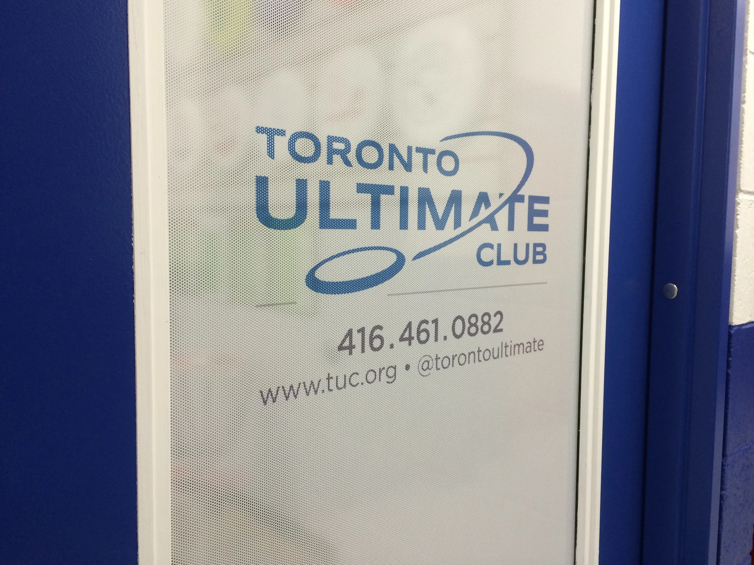
The move to the new clubhouse constituted a need for signage to identify the club office. However, building restrictions allowed only for signs that resided inside the office doors. The solution was a vinyl door screen that served the dual purpose of identifying the office and providing privacy so that passersby would not be able to see into the office.
Field flags were the next item on the agenda, requested for use during outdoor tournaments run by the club. The signs needed to be large, visible from afar, and durable enough to withstand the elements.
After a number of years using the archaic, text-based site, a website redesign was in order. The club manager and site webmaster wanted to ensure the new site was in keeping with the brand and requested for consultation support in working with the design company to develop the new site.


