Leanne Lee Brand Identity
CLIENT: LEANNE LEETHE NEED: A local "mompreneur" sought to build a personal brand that would elevate her presence in the social space and support her entrepreneurial journey as an influencer. The brand identity was designed primarily for social platforms, aiming to set her apart in a niche market as an Asian Canadian mom. The voice needed to be casual, approachable, and relatable—infused with humor to connect with fellow moms of young children and young Asian girls. Additionally, the client wanted to incorporate meaningful symbols into the brand, such as her birth date (7/7) and a representation of her family of four, to create a more personal and authentic touch.
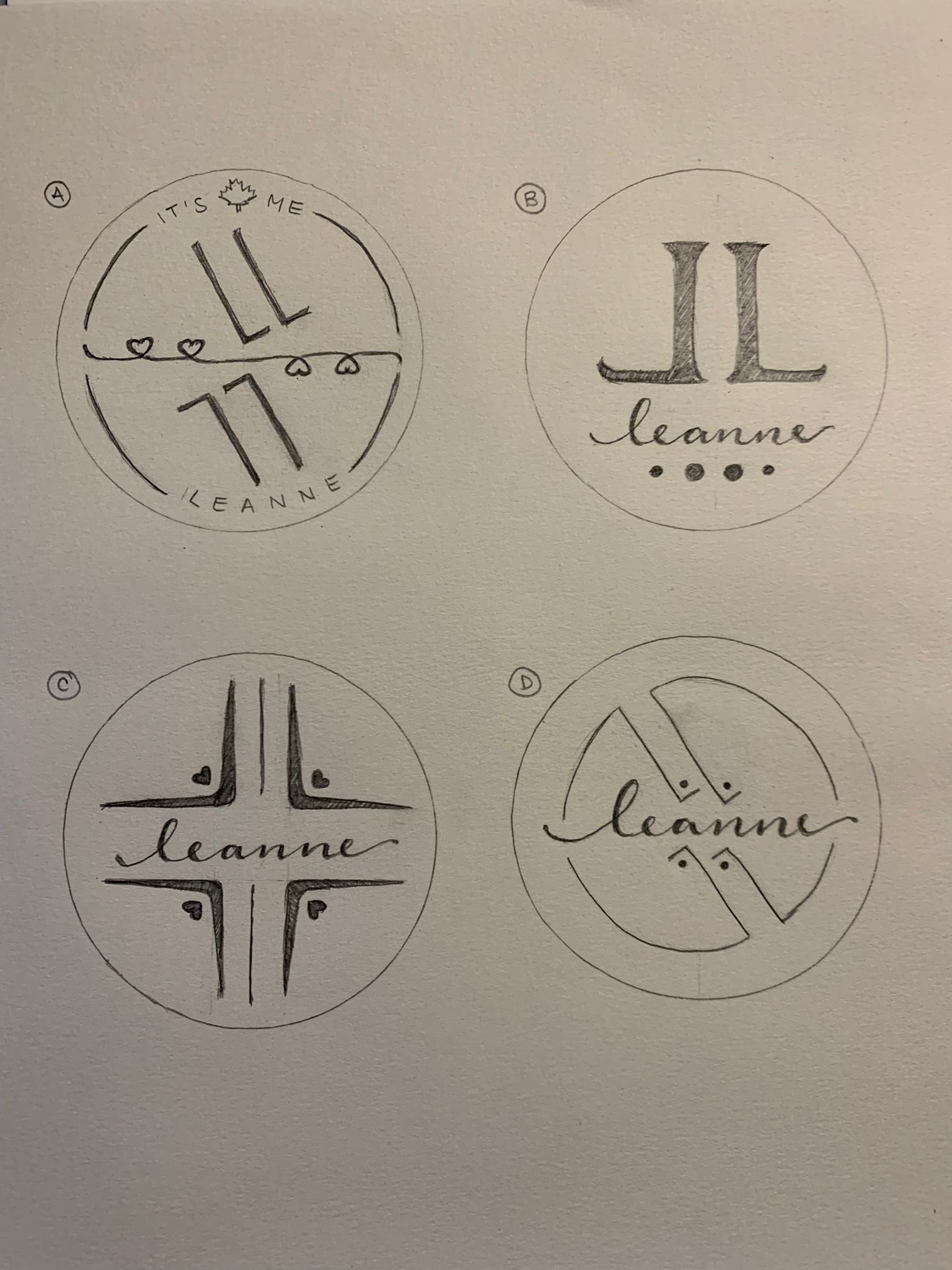
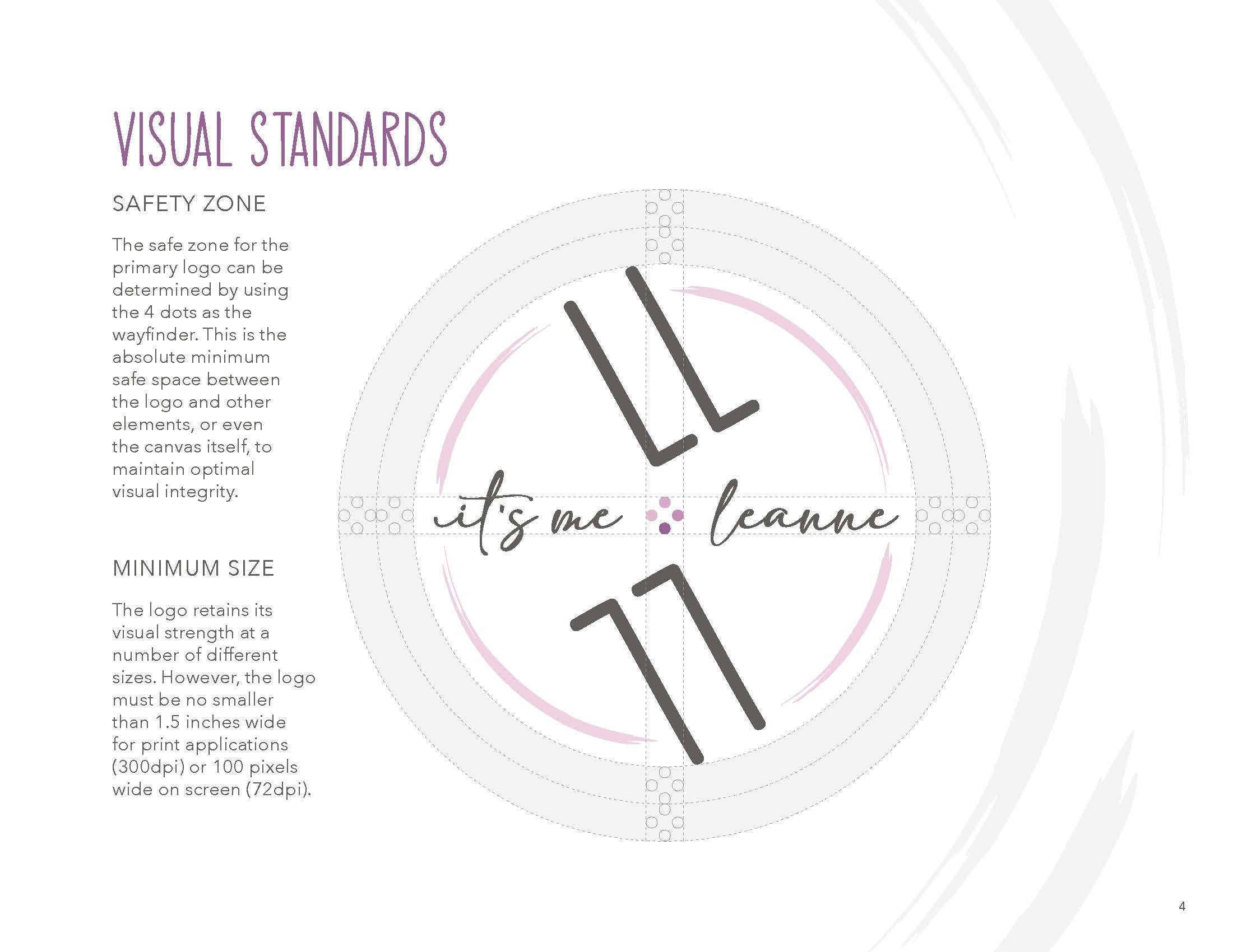
THE SOLUTION: A clean, minimalist handwritten font was selected to reflect the brand's relaxed, approachable tone. The client’s initials, "LL" and "77," were creatively paired with four small dots symbolizing her family at the heart of the logo, underscoring their significance to both her personal and professional identity. Delicate brush strokes were added as the final touch, seamlessly connecting all elements while infusing a sense of playfulness and lightness into the overall design.
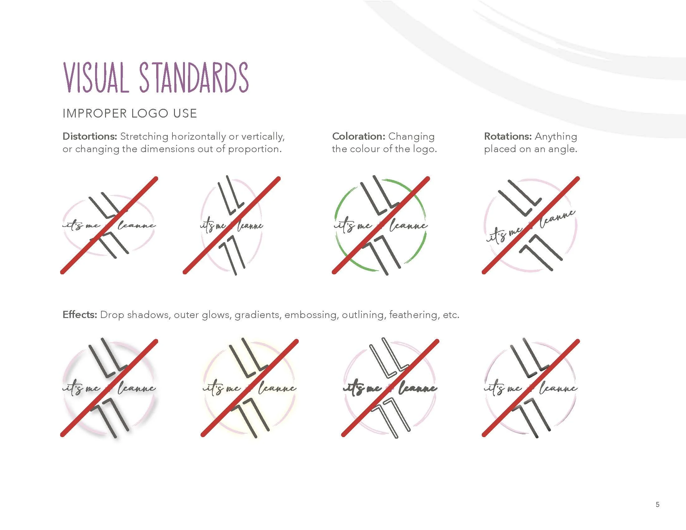
To maintain consistency across all brand materials, a comprehensive brand style guide was developed, outlining the brand’s identity, voice, and visual standards. This guide ensured that vendors and designers could accurately craft assets that aligned with the brand’s unique look and feel.
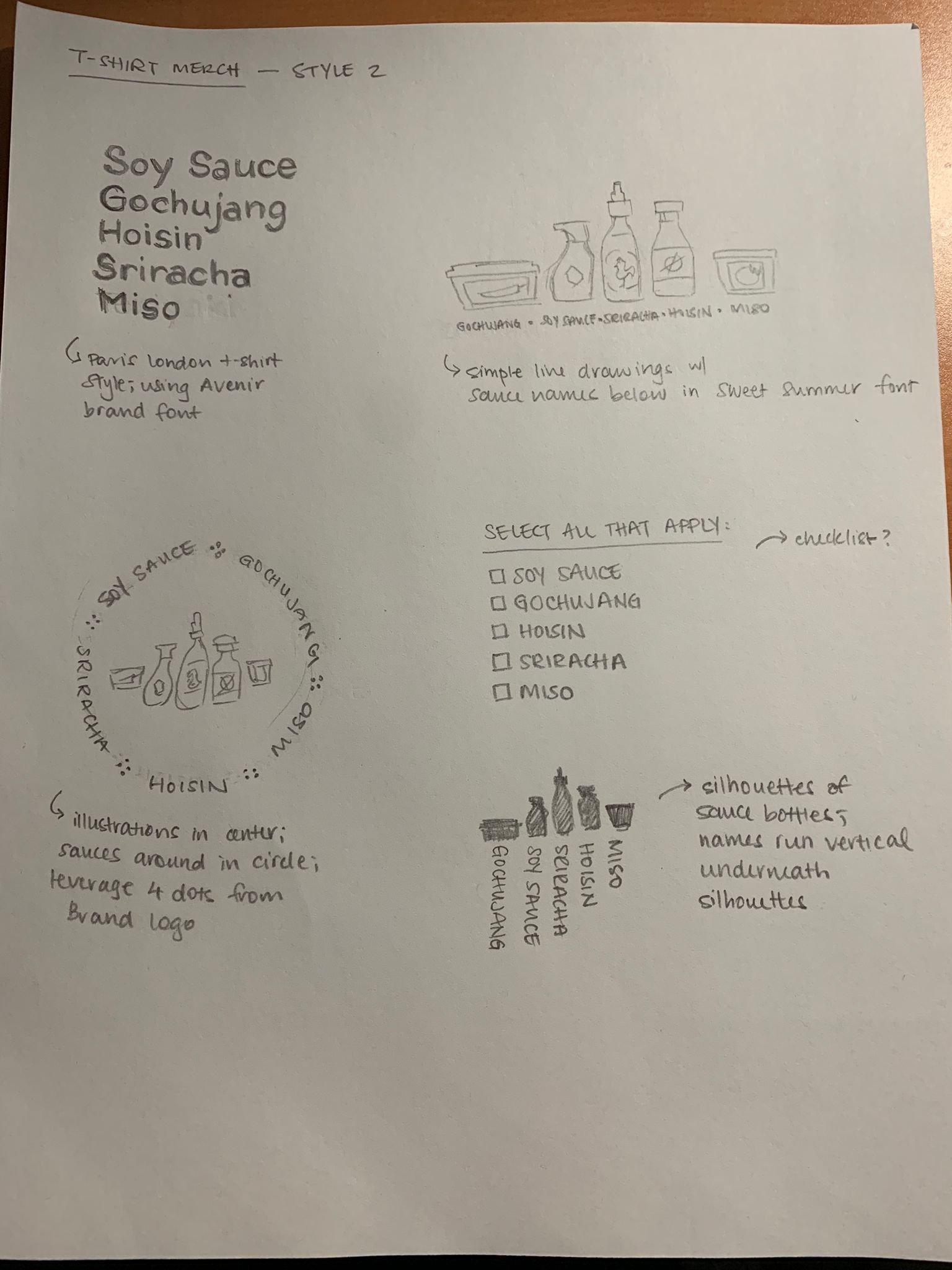
As the next step in expanding the brand’s presence, the client decided to launch a limited-edition merchandise line. Custom illustrations were designed for screen-printed t-shirts and sweatshirts, while a mini version of the logo was added as a subtle detail to the apparel. Colors from the brand’s style guide were thoughtfully incorporated to maintain cohesion with the brand’s established aesthetic.
A few years after the brand’s initial launch, the client revisited the identity, seeking a subtle revision to align it with shifts in her online presence. While maintaining the original tone and aesthetic, key elements of the logo and brand design were thoughtfully reimagined to reflect these changes. The result was a refreshed logo that seamlessly integrates with the evolving digital landscape, ensuring the brand’s visual identity remained relevant and cohesive.


